“The best interface is the one the user never has to think about. They just get things done – and walk away feeling capable.”
I’ve been a UI/UX designer at our company for a while now. And if there’s one thing this job has taught me – through late-night Figma sessions, user testing surprises, and plenty of designs that got scrapped and rebuilt – it’s that design is never just about how something looks. It’s about how it makes someone feel when they’re trying to get something done.
I want to share some of that experience here. Not the polished version you read in design blogs, but the real stuff – the things I’ve learned while working on actual products for actual clients in a service-based IT company, where the stakes are real and the timelines are tight.
It Started with a Confused User and a Sticky Note
Early in my career here, I was working on a client dashboard – an internal tool for a mid-sized logistics company. The development team had built something technically solid. The data was accurate, the backend was fast, the UI was clean by most standards. We were proud of it.
Then we sat down with one of the actual end users – a floor supervisor who would be using this dashboard every single day. Within five minutes, she had a sticky note on her monitor. On it: the steps she had to follow just to find the report she needed most. Every. Single. Day.
That sticky note broke my heart a little. And it changed how I design forever.
We went back, restructured the navigation, surfaced that report front and centre, and added a quick-access panel for the top five actions she used daily. The redesign took two days. Her sticky note disappeared on day one.
That’s UI/UX. Not awards. Not Dribbble likes. A sticky note that doesn’t need to exist anymore.

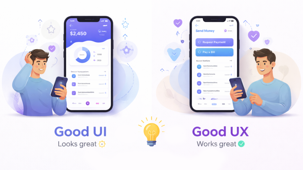
The Gap Between “Looks Good” and “Works Well”
One of the most common things I hear from clients is: “We just need it to look modern.” And I understand – first impressions matter. Visual polish builds trust. But looks can be a trap.
I’ve seen beautifully designed apps with terrible conversion rates. I’ve seen form flows that look elegant in Figma but frustrate users in real life because the tab order is off or the error messages are cryptic. Visual design and UX design are not the same thing. You need both – and they need to work together, not separately.
At our company, we treat UI and UX as two sides of the same coin. When I’m designing a screen, I’m simultaneously asking: does this look credible? And – can someone complete this task without asking for help? Both questions have to get a yes before the design moves forward.
Empathy is a Design Skill – and It’s Underrated
The most valuable tool in my kit isn’t Figma or a colour palette or a component library. It’s the ability to genuinely put myself in someone else’s shoes – to think like a 55-year-old field executive opening an app for the first time, or a college student trying to complete a government form on a 4G connection with a budget Android phone.
Empathy is what tells me that a dropdown menu might work fine on a desktop but is a nightmare to use while standing in a warehouse. It’s what reminds me that not everyone knows what a hamburger menu icon means. It’s what pushes me to question every assumption about who’s actually using what we build.
In a service-based IT company, this matters even more. We build products for a wide range of industries – healthcare, logistics, finance, education. Every user population is different. Every context is different. A one-size-fits-all approach to design is the fastest way to build something that works for nobody.
The three questions I ask before every screen
Over time, I’ve developed a personal checklist that I run through before I consider any screen done:
- What is the user trying to accomplish right now? Not what the system is trying to do. Not what the business wants. What does this specific person need in this specific moment?
- What could go wrong – and have I designed for that? Empty states, error messages, slow loading, wrong inputs – the edge cases are where most UX falls apart. I design the happy path last.
- Would my grandmother be able to use this without help? She’s my unofficial usability benchmark. If I can explain the interface to her in one sentence, it’s simple enough. If I can’t – it needs more work.
Why this Matters for IT Service Companies Specifically
In a product company, you own the thing you build. In a service company like ours, we build things for others – and that means design is a direct reflection of how much we understand our clients’ users, not just their requirements documents.
The best projects I’ve been part of are the ones where the client trusted us to challenge the brief. Where we could say, “Your users told us they don’t actually need three steps here – they need one clear action.” That trust is earned through good research, clear communication, and a genuine investment in the user’s experience – not just the delivery milestone.
Good UI/UX design isn’t a feature. It’s the difference between technology that gets adopted and technology that sits unused. It’s the difference between a client who renews the contract and one who doesn’t. And in my experience, it’s one of the highest-ROI investments any digital product can make.
A final thought
I still get a quiet thrill when I watch someone use something I designed – and they just move through it. No pause. No confusion. No sticky note. Just a person getting their work done, completely unaware of all the decisions that went into making it feel effortless.
That invisibility? That’s the goal. And honestly, I can’t imagine a more satisfying one.
Is your product as easy to use as it should be? Whether you’re building something new or improving what you already have, our design team can help you create experiences your users will actually enjoy.